n8n provides a set of predefined UI components (based on a JSON file) that allows users to input all sorts of data types. The following UI elements are available in n8n.
{displayName:Name,// The value the user sees in the UIname:name,// The name used to reference the element UI within the codetype:string,required:true,// Whether the field is required or notdefault:'n8n',description:'The name of the user',displayOptions:{// the resources and operations to display this element withshow:{resource:[// comma-separated list of resource names],operation:[// comma-separated list of operation names]}},}
String field for inputting passwords:
1 2 3 4 5 6 7 8 9101112131415161718192021
{displayName:'Password',name:'password',type:'string',required:true,typeOptions:{password:true,},default:'',description:`User's password`,displayOptions:{// the resources and operations to display this element withshow:{resource:[// comma-separated list of resource names],operation:[// comma-separated list of operation names]}},}
String field with more than one row:
1 2 3 4 5 6 7 8 9101112131415161718192021
{displayName:'Description',name:'description',type:'string',required:true,typeOptions:{rows:4,},default:'',description:'Description',displayOptions:{// the resources and operations to display this element withshow:{resource:[// comma-separated list of resource names],operation:[// comma-separated list of operation names]}},}
Users can drag and drop data values to map them to fields. Dragging and dropping creates an expression to load the data value. n8n supports this automatically.
You need to add an extra configuration option to support dragging and dropping data keys:
requiresDataPath: 'single': for fields that require a single string.
requiresDataPath: 'multiple': for fields that can accept a comma-separated list of string.
{displayName:'Amount',name:'amount',type:'number',required:true,typeOptions:{maxValue:10,minValue:0,numberPrecision:2,},default:10.00,description:'Your current amount',displayOptions:{// the resources and operations to display this element withshow:{resource:[// comma-separated list of resource names],operation:[// comma-separated list of operation names]}},}
{displayName:'Filters',name:'filters',type:'collection',placeholder:'Add Field',default:{},options:[{displayName:'Type',name:'type',type:'options',options:[{name:'Automated',value:'automated',},{name:'Past',value:'past',},{name:'Upcoming',value:'upcoming',},],default:'',},],displayOptions:{// the resources and operations to display this element withshow:{resource:[// comma-separated list of resource names],operation:[// comma-separated list of operation names]}},}
{displayName:'Modified Since',name:'modified_since',type:'dateTime',default:'',description:'The date and time when the file was last modified',displayOptions:{// the resources and operations to display this element withshow:{resource:[// comma-separated list of resource names],operation:[// comma-separated list of operation names]}},}
The boolean type adds a toggle for entering true or false.
1 2 3 4 5 6 7 8 91011121314151617
{displayName:'Wait for Image',name:'waitForImage',type:'boolean',default:true,// Initial state of the toggledescription:'Whether to wait for the image or not',displayOptions:{// the resources and operations to display this element withshow:{resource:[// comma-separated list of resource names],operation:[// comma-separated list of operation names]}},}
{displayName:'Background Color',name:'backgroundColor',type:'color',default:'',// Initially selected colordisplayOptions:{// the resources and operations to display this element withshow:{resource:[// comma-separated list of resource names],operation:[// comma-separated list of operation names]}},}
{displayName:'Resource',name:'resource',type:'options',options:[{name:'Image',value:'image',},{name:'Template',value:'template',},],default:'image',// The initially selected optiondescription:'Resource to consume',displayOptions:{// the resources and operations to display this element withshow:{resource:[// comma-separated list of resource names],operation:[// comma-separated list of operation names]}},}
{displayName:'Events',name:'events',type:'multiOptions',options:[{name:'Plan Created',value:'planCreated',},{name:'Plan Deleted',value:'planDeleted',},],default:[],// Initially selected optionsdescription:'The events to be monitored',displayOptions:{// the resources and operations to display this element withshow:{resource:[// comma-separated list of resource names],operation:[// comma-separated list of operation names]}},}
Use this component to evaluate, match, or filter incoming data.
This is the code from n8n's own If node. It shows a filter component working with a collection component where users can configure the filter's behavior.
{displayName:'Conditions',name:'conditions',placeholder:'Add Condition',type:'filter',default:{},typeOptions:{filter:{// Use the user options (below) to determine filter behaviorcaseSensitive:'={{!$parameter.options.ignoreCase}}',typeValidation:'={{$parameter.options.looseTypeValidation ? "loose" : "strict"}}',},},},{displayName:'Options',name:'options',type:'collection',placeholder:'Add option',default:{},options:[{displayName:'Ignore Case',description:'Whether to ignore letter case when evaluating conditions',name:'ignoreCase',type:'boolean',default:true,},{displayName:'Less Strict Type Validation',description:'Whether to try casting value types based on the selected operator',name:'looseTypeValidation',type:'boolean',default:true,},],},
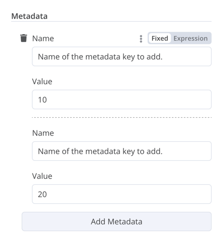
{displayName:'Metadata',name:'metadataUi',placeholder:'Add Metadata',type:'fixedCollection',default:'',typeOptions:{multipleValues:true,},description:'',options:[{name:'metadataValues',displayName:'Metadata',values:[{displayName:'Name',name:'name',type:'string',default:'Name of the metadata key to add.',},{displayName:'Value',name:'value',type:'string',default:'',description:'Value to set for the metadata key.',},],},],displayOptions:{// the resources and operations to display this element withshow:{resource:[// comma-separated list of resource names],operation:[// comma-separated list of operation names]}},}
The resource locator element helps users find a specific resource in an external service, such as a card or label in Trello.
The following options are available:
ID
URL
List: allows users to select or search from a prepopulated list. This option requires more coding, as you must populate the list, and handle searching if you choose to support it.
{displayName:'Card',name:'cardID',type:'resourceLocator',default:'',description:'Get a card',modes:[{displayName:'ID',name:'id',type:'string',hint:'Enter an ID',validation:[{type:'regex',properties:{regex:'^[0-9]',errorMessage:'The ID must start with a number',},},],placeholder:'12example',// How to use the ID in API callurl:'=http://api-base-url.com/?id={{$value}}',},{displayName:'URL',name:'url',type:'string',hint:'Enter a URL',validation:[{type:'regex',properties:{regex:'^http',errorMessage:'Invalid URL',},},],placeholder:'https://example.com/card/12example/',// How to get the ID from the URLextractValue:{type:'regex',regex:'example.com/card/([0-9]*.*)/',},},{displayName:'List',name:'list',type:'list',typeOptions:{// You must always provide a search method// Write this method within the methods object in your base file// The method must populate the list, and handle searching if searchable: truesearchListMethod:'searchMethod',// If you want users to be able to search the listsearchable:true,// Set to true if you want to force users to search// When true, users can't browse the list// Or false if users can browse a listsearchFilterRequired:true,},},],displayOptions:{// the resources and operations to display this element withshow:{resource:[// comma-separated list of resource names],operation:[// comma-separated list of operation names],},},},
Refer to the following for live examples:
Refer to CardDescription.ts and Trello.node.ts in n8n's Trello node for an example of a list with search that includes searchFilterRequired: true.
Refer to GoogleDrive.node.ts for an example where users can browse the list or search.
If your node performs insert, update, or upsert operations, you need to send data from the node in a format supported by the service you're integrating with. A common pattern is to use a Set node before the node that sends data, to convert the data to match the schema of the service you're connecting to. The resource mapper UI component provides a way to get data into the required format directly within the node, rather than using a Set node. The resource mapper component can also validate input data against the schema provided in the node, and cast input data into the expected type.
Mapping and matching
Mapping is the process of setting the input data to use as values when updating row(s). Matching is the process of using column names to identify the row(s) to update.
{displayName:'Columns',name:'columns',// The name used to reference the element UI within the codetype:'resourceMapper',// The UI element typedefault:{// mappingMode can be defined in the component (mappingMode: 'defineBelow')// or you can attempt automatic mapping (mappingMode: 'autoMapInputData')mappingMode:'defineBelow',// Important: always set default value to nullvalue:null,},required:true,// See "Resource mapper type options interface" below for the full typeOptions specificationtypeOptions:{resourceMapper:{resourceMapperMethod:'getMappingColumns',mode:'update',fieldWords:{singular:'column',plural:'columns',},addAllFields:true,multiKeyMatch:true,supportAutoMap:true,matchingFieldsLabels:{title:'Custom matching columns title',description:'Help text for custom matching columns',hint:'Below-field hint for custom matching columns',},},},},
exportinterfaceResourceMapperTypeOptions{// The name of the method where you fetch the schema// Refer to the Resource mapper method section for more detailresourceMapperMethod:string;// Choose the mode for your operation// Supported modes: add, update, upsertmode:'add'|'update'|'upsert';// Specify labels for fields in the UIfieldWords?:{singular:string;plural:string};// Whether n8n should display a UI input for every field when node first added to workflow// Default is trueaddAllFields?:boolean;// Specify a message to show if no fields are fetched from the service // (the call is successful but the response is empty)noFieldsError?:string;// Whether to support multi-key column matching// multiKeyMatch is for update and upsert only// Default is false// If true, the node displays a multi-select dropdown for the matching column selectormultiKeyMatch?:boolean;// Whether to support automatic mapping// If false, n8n hides the mapping mode selector field and sets mappingMode to defineBelowsupportAutoMap?:boolean;// Custom labels for the matching columns selectormatchingFieldsLabels?:{title?:string;description?:string;hint?:string;};}
This method contains your node-specific logic for fetching the data schema. Every node must implement its own logic for fetching the schema, and setting up each UI field according to the schema.
It must return a value that implements the ResourceMapperFields interface:
1 2 3 4 5 6 7 8 9101112131415161718192021222324
interfaceResourceMapperField{// Field ID as in the serviceid:string;// Field labeldisplayName:string;// Whether n8n should pre-select the field as a matching field// A matching field is a column used to identify the rows to modifydefaultMatch:boolean;// Whether the field can be used as a matching fieldcanBeUsedToMatch?:boolean;// Whether the field is required by the schemarequired:boolean;// Whether to display the field in the UI// If false, can't be used for matching or mappingdisplay:boolean;// The data type for the field// These correspond to UI element types// Supported types: string, number, dateTime, boolean, time, array, object, optionstype?:FieldType;// Added at runtime if the field is removed from mapping by the userremoved?:boolean;// Specify options for enumerated typesoptions?:INodePropertyOptions[];}
{displayName:'Content (JSON)',name:'content',type:'json',default:'',description:'',displayOptions:{// the resources and operations to display this element withshow:{resource:[// comma-separated list of resource names],operation:[// comma-separated list of operation names]}},}
The HTML editor allows users to create HTML templates in their workflows. The editor supports standard HTML, CSS in <style> tags, and expressions wrapped in {{}}. Users can add <script> tags to pull in additional JavaScript. n8n doesn't run this JavaScript during workflow execution.
1 2 3 4 5 6 7 8 91011
{displayName:'HTML Template',// The value the user sees in the UIname:'html',// The name used to reference the element UI within the codetype:'string',typeOptions:{editor:'htmlEditor',},default:placeholder,// Loads n8n's placeholder HTML templatenoDataExpression:true,// Prevent using an expression for the fielddescription:'HTML template to render',},
There are two types of hints: parameter hints and node hints:
Parameter hints are small lines of text below a user input field.
Node hints are a more powerful and flexible option than Notice. Use them to display longer hints, in the input panel, output panel, or node details view.
Define the node's hints in the hints property within the node description:
1 2 3 4 5 6 7 8 910111213141516171819
description:INodeTypeDescription={...hints:[{// The hint message. You can use HTML.message:"This node has many input items. Consider enabling <b>Execute Once</b> in the node\'s settings.",// Choose from: info, warning, danger. The default is 'info'.// Changes the color. info (grey), warning (yellow), danger (red)type:'info',// Choose from: inputPane, outputPane, ndv. By default n8n displays the hint in both the input and output panels.location:'outputPane',// Choose from: always, beforeExecution, afterExecution. The default is 'always'whenToDisplay:'beforeExecution',// Optional. An expression. If it resolves to true, n8n displays the message. Defaults to true.displayCondition:'={{ $parameter["operation"] === "select" && $input.all().length > 1 }}'}]...}
In programmatic-style nodes you can create a dynamic message that includes information from the node execution. As it relies on the node output data, you can't display this type of hint until after execution.
1 2 3 4 5 6 7 8 910111213
if(operation==='select'&&items.length>1&&!node.executeOnce){// Expects two parameters: NodeExecutionData and an array of hintsreturnnewNodeExecutionOutput([returnData],[{message:`This node ran ${items.length} times, once for each input item. To run for the first item only, enable <b>Execute once</b> in the node settings.`,location:'outputPane',},],);}return[returnData];
For a live example of a dynamic hint in a programmatic-style node, view the Split Out node code.